UX/UI Design

Shelfy

2019 to 2022

An application that brings together the news from the most important and widely read newspapers and magazines in Argentina.

Shelfy app cover

Challenge

Fragmented Ecosystem

40 separate apps existed, one per region, each with its own codebase and experience. The goal was to unify them into a single product without losing the local identity each audience was used to.

Content Discovery

Users had no way to explore beyond their main feed. They needed to discover related articles while reading and follow specific journalists they trust.

User Control

The existing apps offered no customization. Users couldn't add, edit or organize their own media sources. Everything was predefined by the platform.

Retaining an Older Audience

The core audience skewed older and was deeply attached to the shelf-and-paper metaphor. Any redesign had to modernize the experience without alienating loyal users.

Shelfy case study research
Shelfy user flow

Familiar Yet Modern

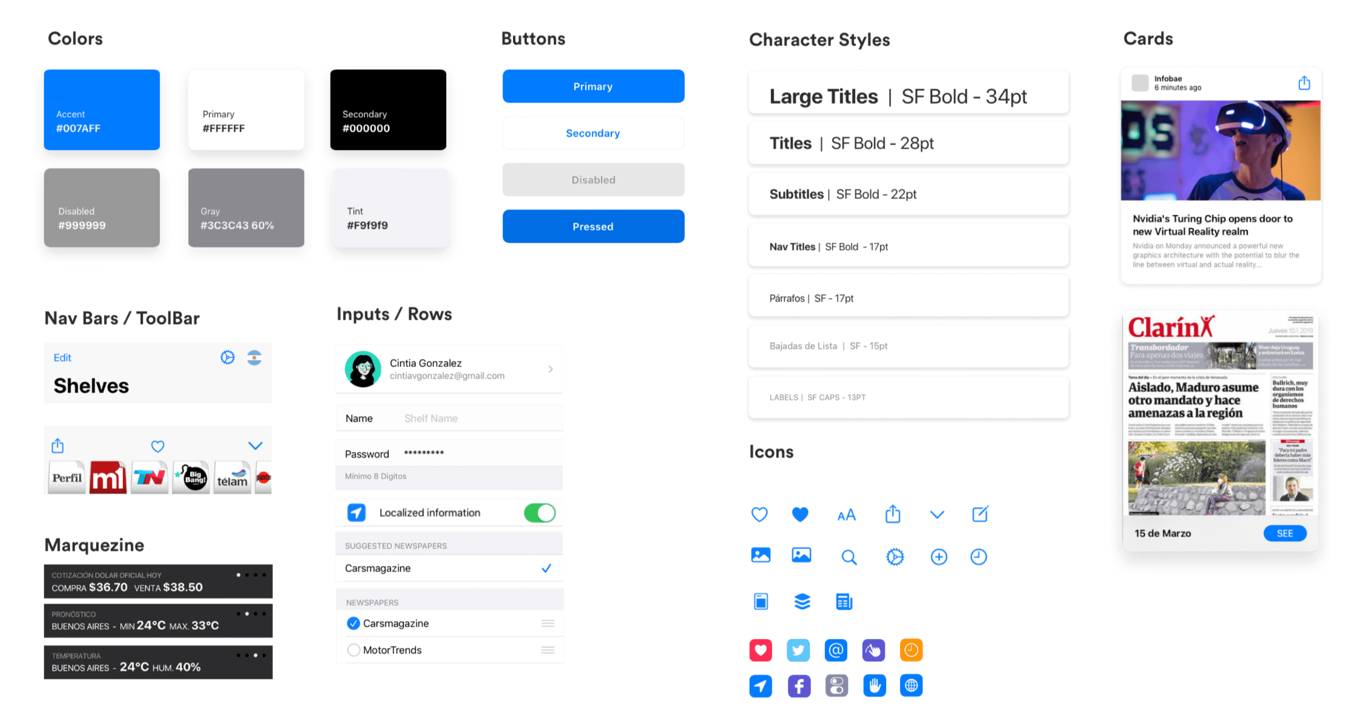
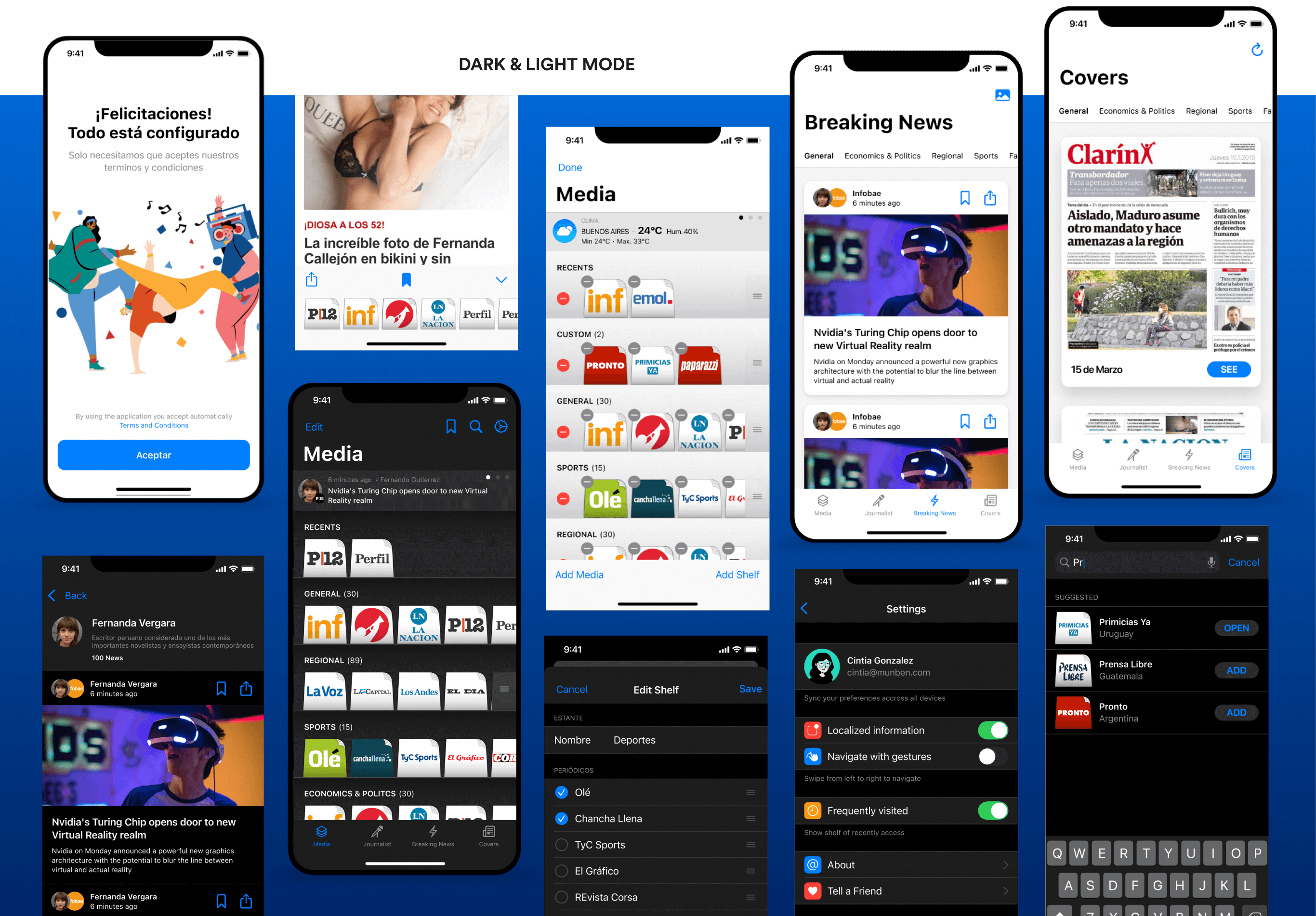
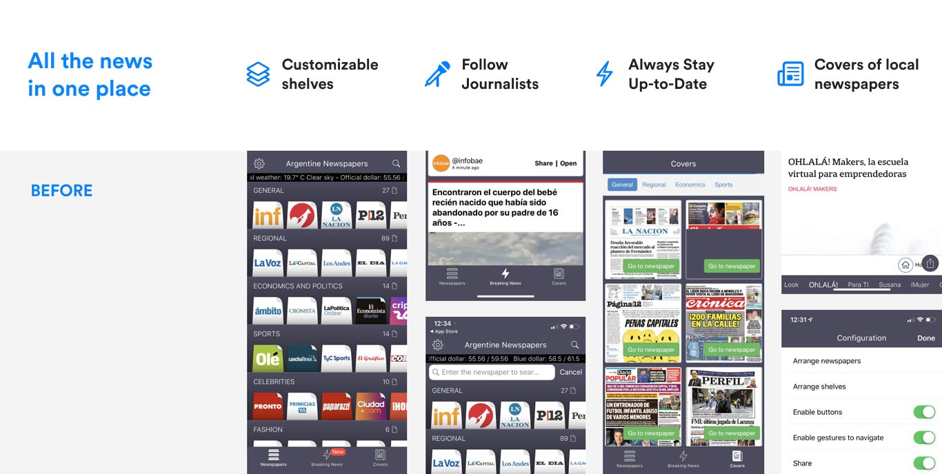
The original app relied on a dark gray palette that felt dated. As part of the migration to native iOS, we introduced a light and dark mode, giving the interface a fresh, contemporary feel while preserving readability.

The signature shelves-and-papers metaphor was kept intentionally. The audience skewed older and had a strong attachment to that interaction model, so the visual system needed to modernize without breaking the mental model they relied on.

Shelfy UI design screens
Shelfy UI kit and components