Brand & UX

Chicas en Tecnología

2019 to 2021

An Argentinean non-profit civil society organization that has worked to reduce the technology gender gap since 2015.

Branding

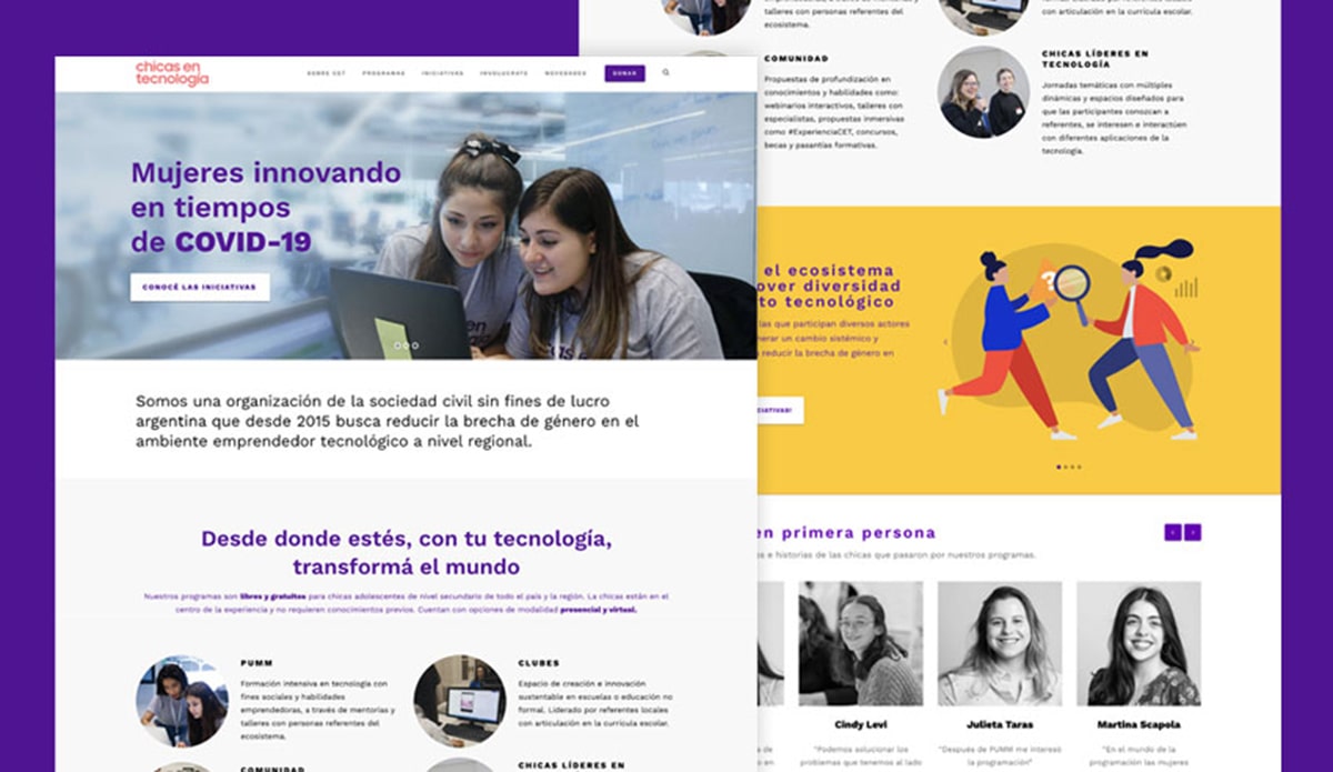
The identity was designed to resonate with young girls while avoiding reductive visual codes. The color system centers on saturated violets, creating a bold and energetic presence that feels contemporary and distinctive.

The logo is responsive and adaptable across formats. A deliberate detail appears in the "T" of Cet: a gap in the letterform symbolizes the gender gap in technology; the issue the organization works to address.

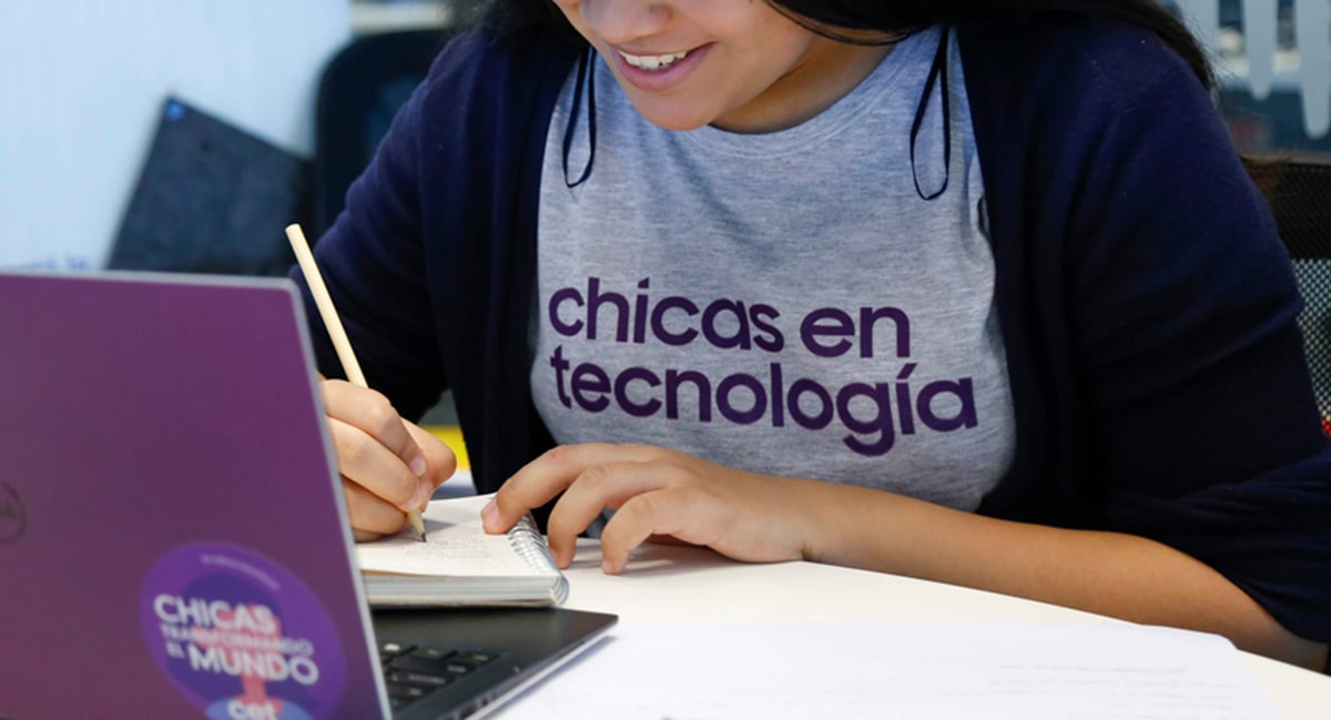
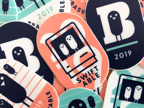
The system extends to T-shirts, badges, stickers, totebags and more, all built to work at any scale and feel cohesive across digital and physical touchpoints.

Chicas en Tecnología logo design
Chicas en Tecnología t-shirt designChicas en Tecnología t-shirt variations

Scaling the Digital Presence

As the organization grew, so did the complexity of its programs and initiatives. The site they had since 2015 was a CMS that became difficult to maintain and impossible to navigate. It no longer reflected the scale or ambition of the organization.

Through a Design Thinking workshop with stakeholders from different areas, we identified key takeaways about the target audience and the information the organization wanted to prioritize, leading to a complete redesign of the site's structure and experience.

visit site (opens in new window)

Chicas en Tecnología website design
Chicas en Tecnología website pages
Chicas en Tecnología information architecture