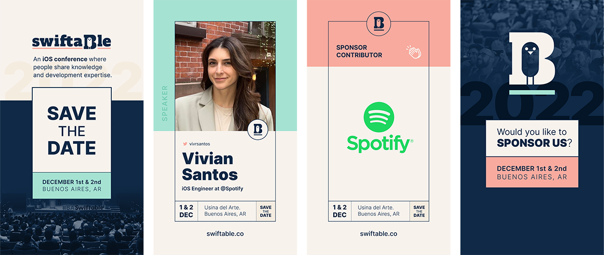
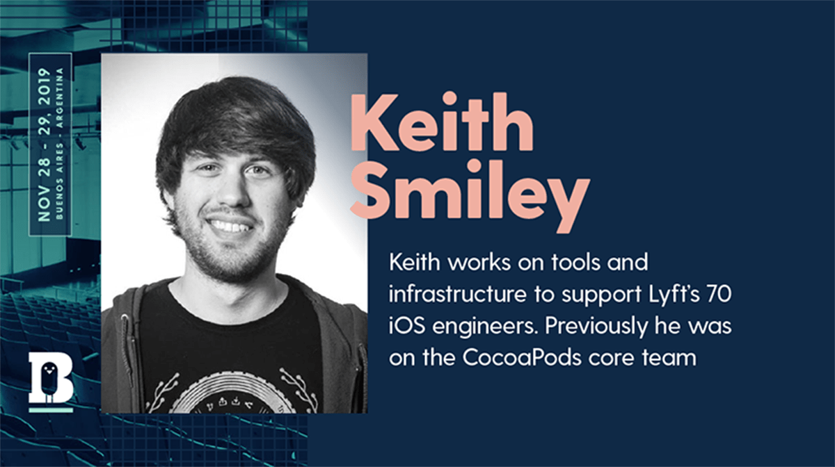
The project came with an existing logo but no defined visual system. The original palette was white, light gray and pink, which felt disconnected from the audience: the iOS developer community in Latam is predominantly male, and the colors didn't communicate the modern, technical energy the conference needed.
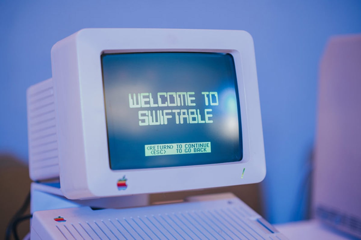
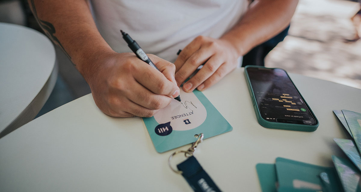
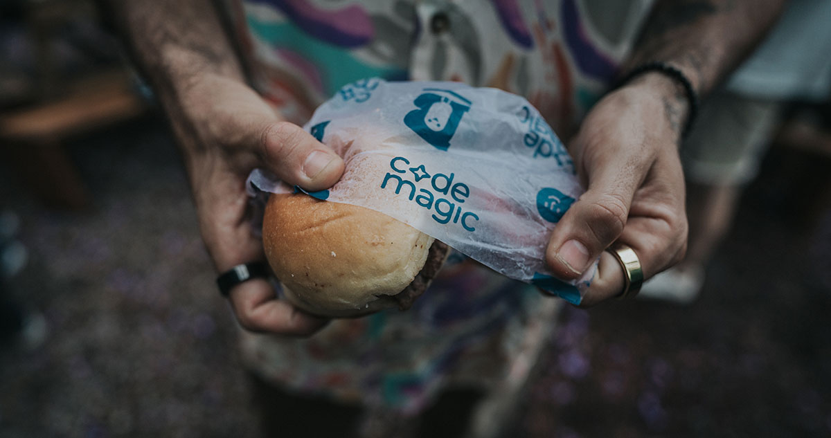
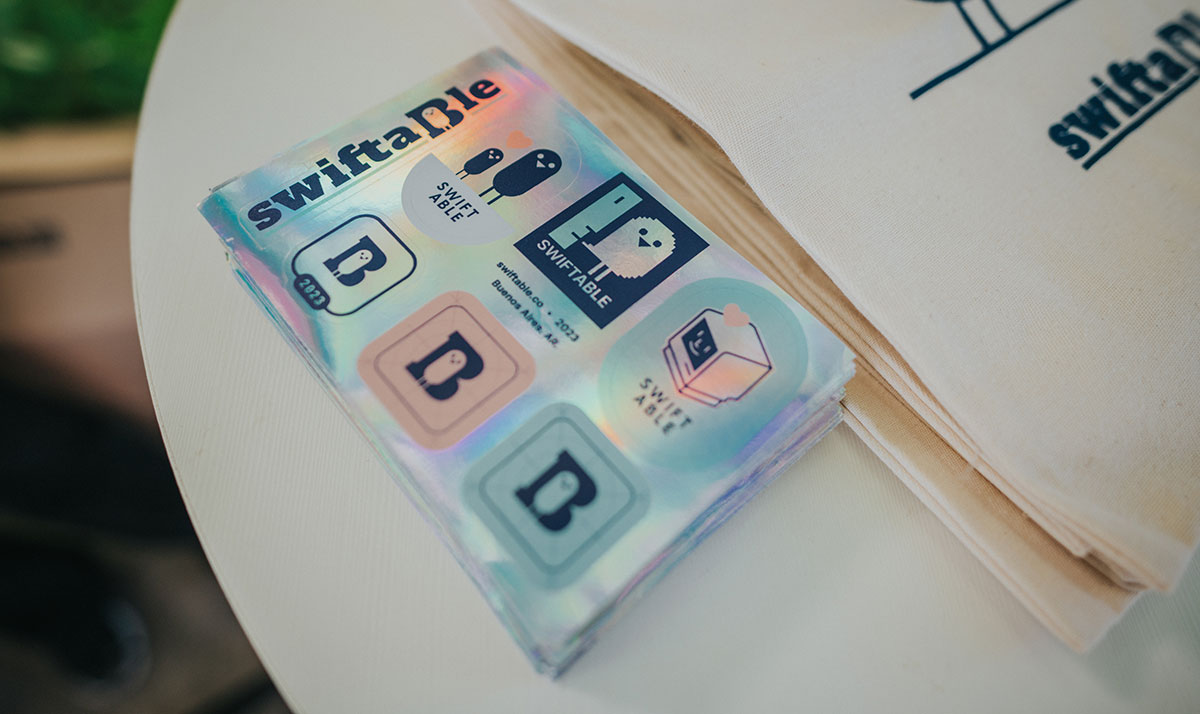
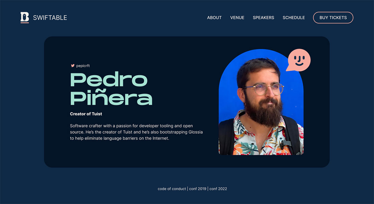
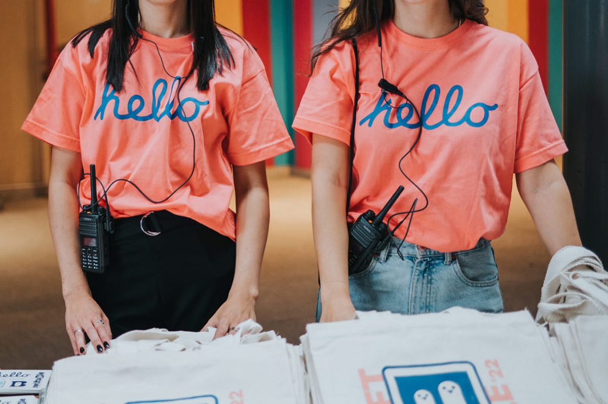
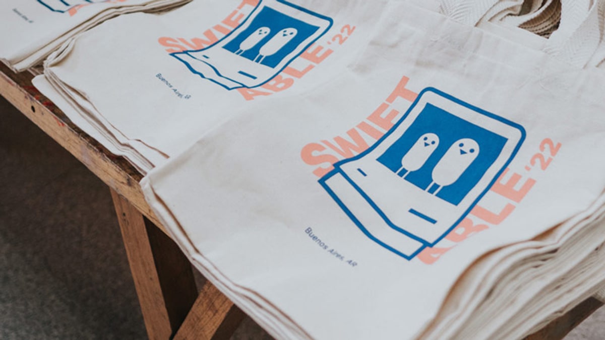
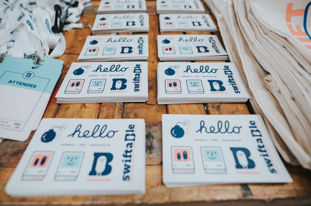
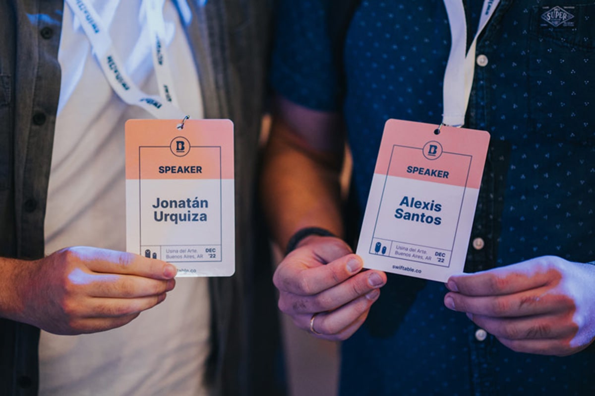
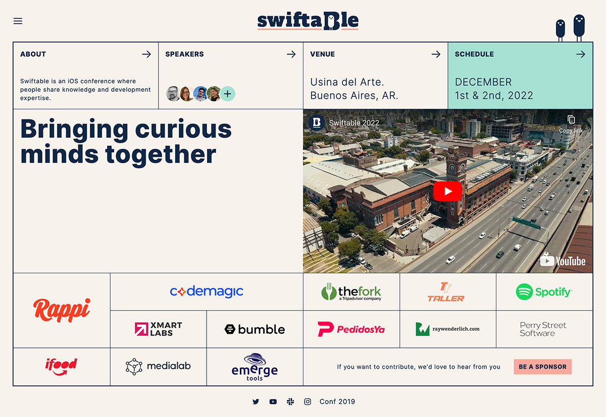
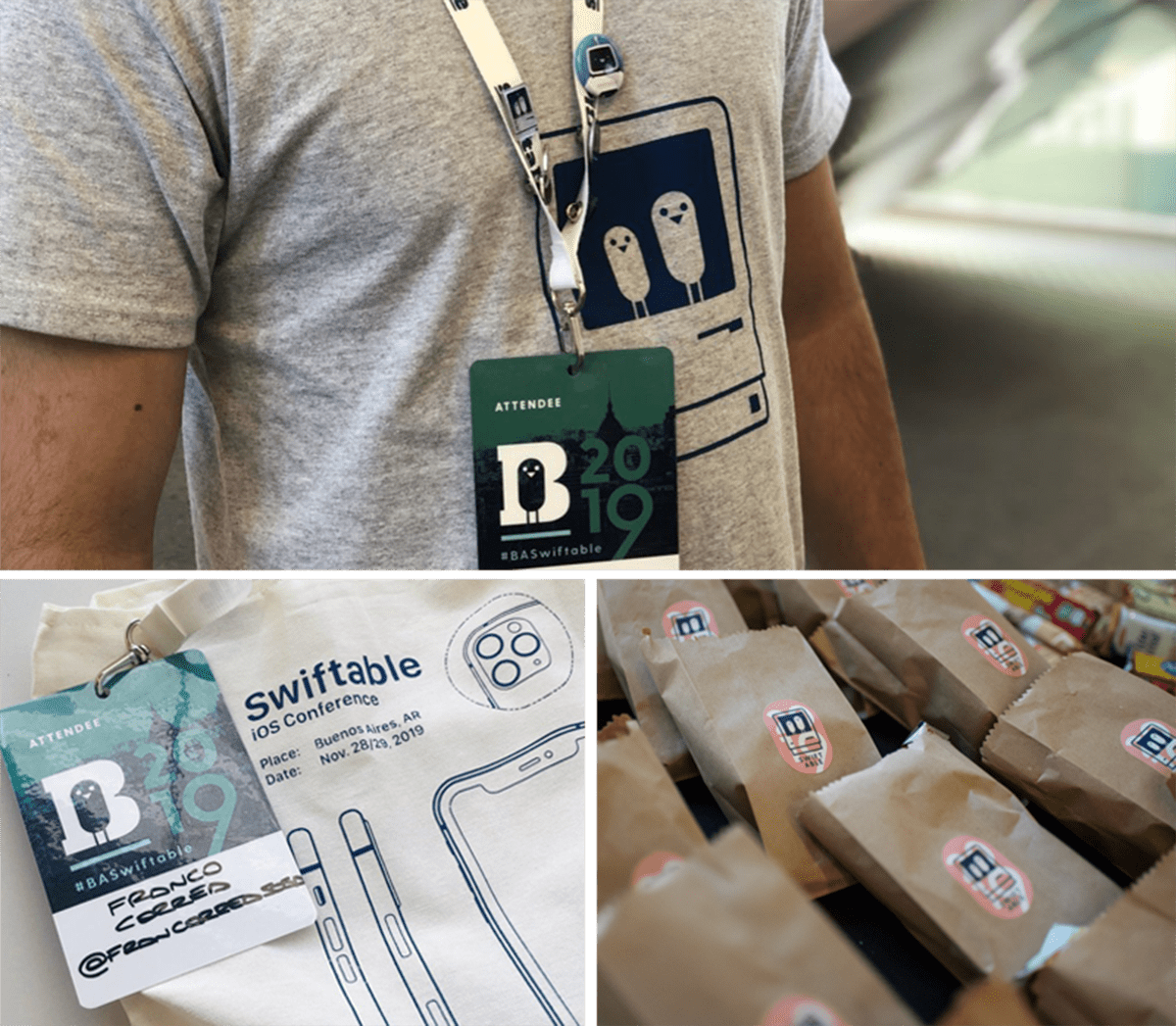
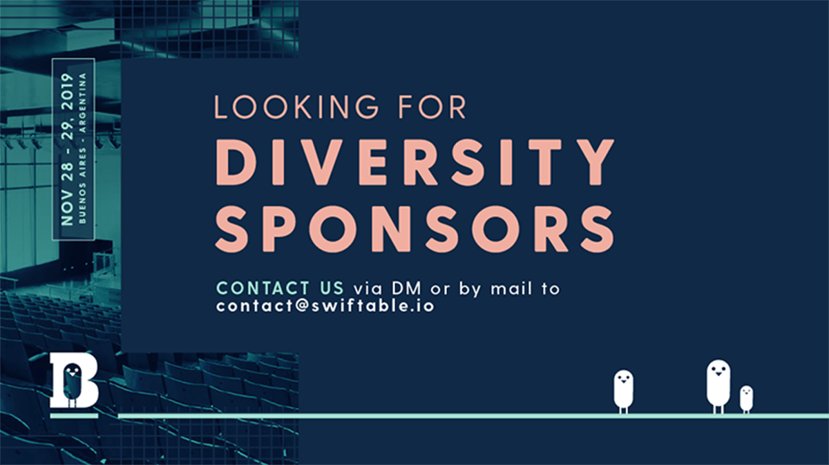
I kept the logo but rebuilt the color system around deep teal, coral and warm neutrals, leaning into a retro-inspired aesthetic that carries across every touchpoint: from the hand-drawn character illustrations and playful typography on the merch to the vintage grid layout of the website, which I also designed and coded.
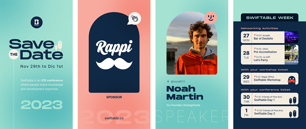
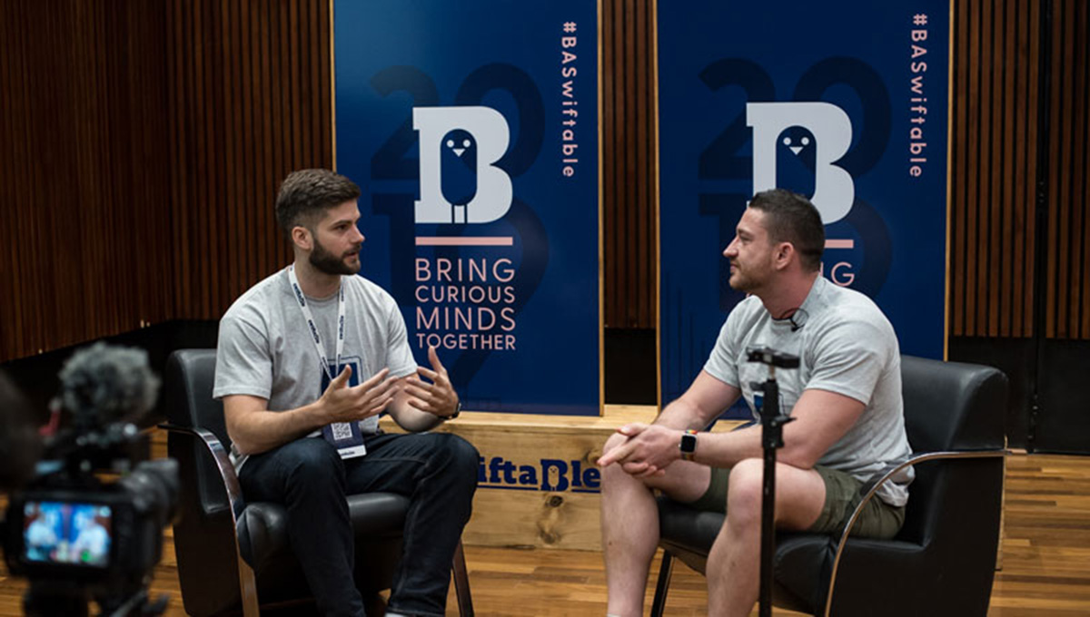
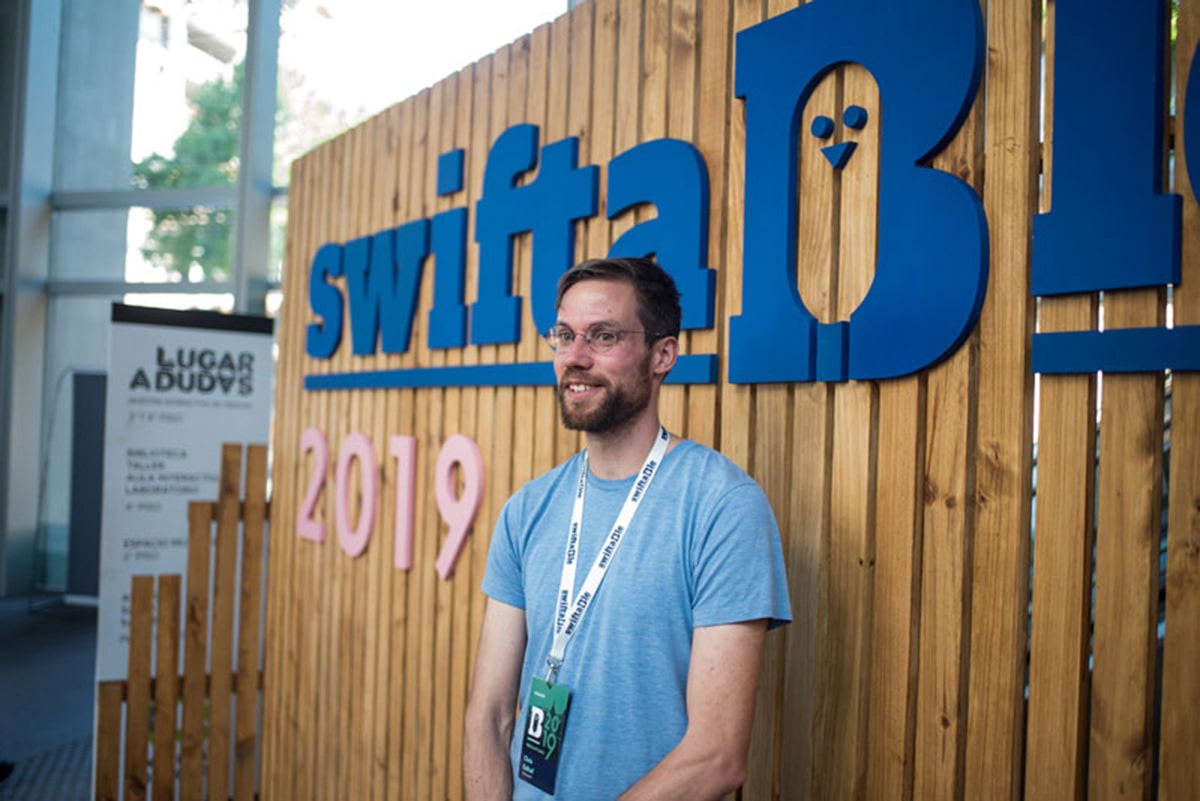
Each year the brand iterated, new illustrations, new materials, new social media formats, but always with the same personality. The goal was to make every edition feel fresh while instantly recognizable as Swiftable.
