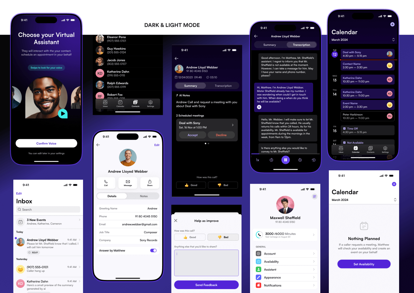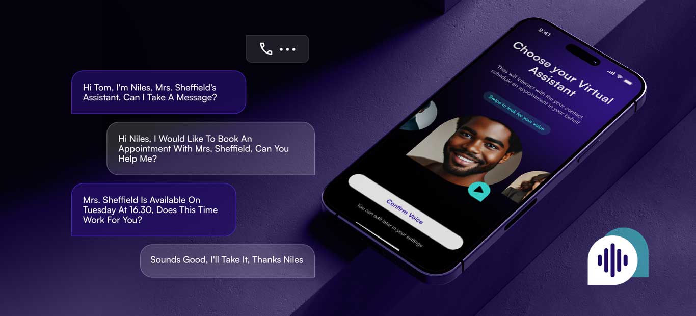
Following user research on trust and efficiency in AI communication, I developed a dual-theme color system anchored in deep purple for focus and teal for action, colors selected to communicate reliability and technological agility. The brand identity, including the custom app icon, reinforces this connection through geometric precision and gradient energy.
The UI maintains strict visual consistency: avatar-based contact identification, structured AI summaries with clear hierarchy, and color-coded calendar markers for quick scanning. Components like toggles, modals, and navigation follow predictable patterns, ensuring users maintain control while the AI handles complexity in the background.